Leaflet Creation

Business Leaflet Design

The purpose of a leaflet may vary from business to business, but one rule sits firm, it needs to be fit for purpose, audience and occasion and most importantly it must generate a response.

This article outlines five questions to guide your creative brief towards getting your most wanted result from a business leaflet design.

Some leaflets simply display services or focus on selling a product. In this sense they often make the mistake of leading with features instead of promoting benefits.

People rarely ‘buy’ on first seeing your advert or leaflet. In fact, research shows that on average it takes 7 messages before someone decides to buy your product or services.

Here are five key questions you should have crystal clear answers to before spending time and money on expensive leaflet design and printing.

1. Who are you targeting, specifically?

If you aim at nothing (or no-one), you’ll hit it every time! Can you clearly identify your ideal prospect (customer, client or business), i.e. who you are really wanting to target with this leaflet?

The style for your leaflet should fit your specific audience. It needs both to create impact and offer the results your clients want. Make your imagery and headlines stand out and address specifically the issue, need or problem your target audience is looking to resolve.

The buying process is a series of decisions where the customer is finding out if what you have is for them, whether they like you and trust to buy from you, and how easily and quickly they will receive after ordering.

2. How will you reach them, physically?

How, where and when are you intending to distribute the leaflets? Are you mailing, flyering houses and/or businesses, using a distribution service, handing out on streets or booking a stand at relevant events & exhibitions?

Whatever your strategy, there are different costs involved, be it time or money. Handing out a leaflet rather than posting anonymously means you may have a chance for eye contact with your prospects, even a short conversation where you can build some rapport.

Always do a trial run with a small sample first and review the response rate. If you get a reasonable response from the trial, you can increase, or you could first analyse how many of the leads/enquiries actually convert to customers.

From these results, you will have a good idea of what methods work best, what the conversion rate is in terms of sales & profits. This lowers the risk of doing a bigger and more expensive mailshot.

3. What is your unique value proposition?

The value of what you offer should be very prominent on your leaflet.

This can be money related, but often is more subtle in the form of representing what you do, why you do it, and the benefits and results that your product or service provides to customers/clients.

How are you different from other businesses/companies that do something similar, particularly if they are cheaper or more well known?

4. What is your most wanted response?

Since we know that people rarely buy on impulse, unless you are in that kind of industry/market, you need a strong, clear ‘call to action’. Your leaflet or brochure is intended to take your ‘prospect’ to the next step in the sales funnel, not an instant sales tool.

Be very clear what you want people to do as a result of seeing (and hopefully reading) your leaflet. Should they call you, visit your website or a specific page on your site, book an appointment.

Consider some incentive or special offer. Give it adequate design space and make it easy for your prospect to take that step. Once you’ve inspired someone to take action, you want zero obstacles in their path!

A popular offer is xx% off or a free xx with this leaflet, which would make it more likely to be kept for future rather than ending up in the bin. This obviously depends upon what product/service you are promoting.

5. Is your text, images and layout helping or hindering?

content is kingThe design look is obviously a factor in getting your message across. But your leaflet text and imagery is the main substance, as they say ‘content is king’. Whether using a single sheet flyer or a bi-fold or tri-fold brochure, the visual appeal is an important factor.

Once you have clarified your main messages, write text that is interesting, engaging and simple to understand. You should address the ‘conversation going on in your ideal customers head’.

Get across your value proposition – aim to convey what’s good about what you are offering using words that are emotional triggers (not just hype).

Avoid lots of dense text and long narratives – remember less is more. Too much information on a small leaflet just doesn’t look inviting to read and can turn people off.

Use vibrant, high quality and relevant images, bold headings and recognise the need for white space. This breaks up text, directs the eye and whets the appetite, which is really important in a small space.

Finally, proof your leaflet, not only spellings but the overall design. Then have someone else check it for sense and typos you don’t always spot yourself when you’re too close to it.

Does your leaflet tick all these boxes: Attention, Interest, Desire, Action? If so, you are definitely on a good track.

Share Button

QR Codes For Leaflet Distribution

Todays question is about QR Codes for leaflet distribution, are they a good idea or a big no no?

Qr Codes and leaflets

Confused about QR codes

The advertising world, not to mention the public, is very divided on the subject of QR codes.

You may have seen QR codes on bus stop ads and in magazines, they are basically bar codes that when scanned with the camera of a smart phone using a special app will automatically open a related web page.

So far so good, anything that makes advertising more interactive for the consumer is a good thing, right? Well, not exactly.

The problem is that the industry got so excited about the concept of interacting with print adverts that they didn’t always think through the various stages of their campaigns properly, resulting in some awful follow-up pages.

As a result, the QR codes have also been tainted in the eyes of some consumers as well, who consequently see no value in them.

Link to your site with QR codes

Is your website mobile friendly

Problems come when QR codes are used without thought, resulting in the user either being directed to a non-mobile-friendly website, or to a page telling them exactly the same information as the advert.

But when used correctly, they can have massive impact. We have been using QR codes here at Hallway Distribution for our clients for a couple of years now and we love them, they are a great way to combine offline and online effectively. They can be a great tool in taking the user one step further down the buying funnel and closer to an end purchase.

Driving customers to a special offers page or a voucher code to redeem in store is a fantastic way to measure integration versus redemption rate for a leaflet distribution campaign. It also allows you to compare the return rate from leaflets distributed in different regions effectively.

Information such as this is invaluable to help you fine tune future leaflet distribution campaigns. If 300 people downloaded the voucher but only a handful redeemed it, then the leaflet was a success but was there an issue with either the offer itself or the demographic of residents that received it?

Using this information means you can confidently adapt your offering and garner even more success from your next campaign.

Your views and opinions are always useful to us here at Hallway Distribution,  so please comment away in the box below and we will answer as soon as we can.

Is your business mobile friendly, check out a short post on our sister marketing site.

Share Button

Marketing With The Right Colour

So how do you see colour affecting your marketing, this includes online as well as offline. Get the colour wrong and you may well struggle to strive, sounds silly but the psychology behind the use of colours is massive.

Did you know that the colours you choose for your marketing materials affects the impact they make on your target market?

Colors act as a sort of non-verbal communication. They also contain symbolism. So in your marketing pieces, it is helpful to keep in mind how the eye and the mind perceive certain colors as well as what the meanings are that we associate with each color.

Sometimes colours create a physical reaction (i.e., red has actually been shown to raise blood pressure and blue is known to create a calming effect). And other times colours have a cultural meaning (i.e., in the United States & Great Britain white is used for weddings but in some cultures it is the colour for mourning).

Colours also follow trends. For example, burnt orange and avocado are synonymous with the 60s and 70s to many consumers, so unless you’re selling a retro look, it’s best to avoid those as the primary colour for your marketing.

To understand the impact marketing with the right colour has we need to know about colour theory.

Finding a good combination of colours be tough. Colour theory makes it easier. In order to find a good colour scheme (the set of colours that produces the best impression), we need to choose a base colour then see which colours can coexist with it and which can’t. Some combinations are uncomfortable, or disturbing, while others are pleasant.

As you probably know from school, the primary colors are red, blue and yellow. All other colors are made by combining two or three of these colors. Primary colours are seen as simple and direct. So they would be good to use for projects that aren’t extravagant such as for preschools, kids’ stores, etc.

Secondary colours are half way between the three primary colours. They are orange, green and violet. Bright secondary colours can convey action and excitement. They would be great to use for sports brochures, restaurants that have a lively clientele, etc.
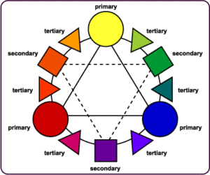
Tertiary colours are created when primary colors are mixed with adjacent secondary colours. Take a look at the colour wheel and notice which colours are considered tertiary. You’ll notice that they are in between primary and secondary colors. Teal and fuchsia are tertiary colours.

Hue, saturation and value of colours
Infinite colors can be created by altering three variables: the hue, the saturation and the value of the colour.

The hue is the shade of a particular colour. Deep hues of violet, gold, maroon, etc. are used by marketers to convey richness and security while earth tones feel natural and inviting.

The purity of a hue is the saturation. A highly saturated hue has a vivid, intense colour, while a less saturated hue appears more muted and grey.

Value refers to the relative lightness or darkness of a certain area. It is often used for emphasis. For example, variations in value are used to create a focal point for the design of a picture.

Colours often have different meanings in different cultures as we discussed before. If you will be working with a client from another part of the world, it would be beneficial for you to do a little research to find out what colours mean in that society.

Even in Western societies, the meanings of various colours have changed over the years. But today, researchers have generally found the following to be accurate:

Black
Black is the colour of authority and power. It is popular in fashion because it makes people appear thinner. It is also stylish and timeless. Use the colour black to convey elegance, sophistication, or perhaps a touch of mystery. Black works well with bright, jewel-toned shades of red, blue, and green. Black is the ultimate dark colour and makes lighter colours such as yellow really pop out. Photographs often look brighter against a black background.

White
Doctors and nurses wear white to imply sterility. In most Western countries white is the colour for brides; however, in Eastern cultures it’s the colour for mourning and funerals.

In most cases white is seen as a neutral background colour and other colours, even when used in smaller proportion, are the colors that convey the most meaning in a design. Use white to signify cleanliness or purity or softness. Some neutral beige, ivory and creams carry the same attributes as white but are more subdued, less brilliant than plain white.

Used with light or pastel tones, white is soft and spring like and helps to make the pastel palette more lively. White can make dark or light reds, blues and greens look brighter, more prominent.

Brown
Brown represents wholesomeness and earthiness. The colour brown and its lighter versions tan, taupe, beige or cream make excellent backgrounds helping accompanying colours appear richer, brighter. Use brown to convey a feeling of warmth, honesty and wholesomeness. Although found in nature all year round, brown is often considered an autumn and winter colour. It is more casual than black.

Shades of brown coupled with green are often used to convey the concept of recycling or earth-friendly products. Light brown implies genuineness while dark brown is similar to wood or leather. Brown can also be sad and wistful.

Red
Red is power. The most emotionally intense colour, red stimulates a faster heartbeat and breathing. It is also the colour of love. Use red to grab attention and to get people to take action. Use red to suggest speed combined with confidence and perhaps even a dash of danger. A little bit of red goes a long way. Small doses can often be more effective than large amounts of this strong colour. Multiple shades of red and even pink or orange can combine for a cheerful palette. Red is often used in restaurant decorating schemes because it is an appetite stimulant.

Pink
The most romantic colour is pink and can be tranquilising. Sports teams sometimes paint the locker rooms used by opposing teams bright pink so their opponents will lose energy. Studies have shown that large amounts of pink can create physical weakness in people.

Both red and pink denote love but while red is hot passion, pink is romantic and charming. Use pink to convey playfulness or tenderness. Add strength with darker shades of pinks and purple and burgundy.

All shades of pink get sophisticated when combined with black or grey or medium to darker shades of blue. Medium to dark green with pink is also a good combination.

Blue
Blue is one of the most popular colours. It causes the opposite reaction as red. Peaceful, tranquil blue causes the body to produce calming chemicals.

Blue conveys importance and confidence. Long considered a corporate colour, blue, especially darker blue, is associated with intelligence, stability, unity, and conservatism.

A deep royal blue or azure conveys richness and perhaps even a touch of superiority. Combine a light and dark blue to convey trust and truthfulness. Create a conservative but sophisticated look with subtle contrast by combining light and dark shades of blue.

Mix the color of blue with green for a natural, watery palette. Add grey for understated elegance.

Sky blue and robin’s egg blue, especially when combined with neutral light brown, tans, or beige are environmentally friendly color combinations.

Throw in a dash of blue to cool down a hot red or orange scheme. Grab attention with the contrast of blue and yellow.

Dark blue with white is fresh, crisp and nautical. Use dark blue with metallic silver accents for an elegantly rich appearance.

Green
Green symbolises nature. It is the easiest colour on the eye and can improve vision. It is a calming, refreshing colour. Hospitals often use green because it relaxes patients. Dark green is masculine, conservative and implies wealth.

With both a warming and cooling effect, green denotes balance, harmony, and stability. Use several shades of green for a fresh, springtime feel.

Green with blue produces echoes of nature, water and forest and can denote new beginnings and growth. Green with brown, tan, or beige says organic or recycled and can be a good colour combination for packaging of those types of products. Tri-color combinations of green with yellow and black or white are sporty, outdoorsy colors. Purple with green can be highly contrasting causing a lively effect.

Yellow
Cheerful sunny yellow is an attention getter. While it is considered an optimistic colour, people lose their tempers more often in yellow rooms, and babies will cry more. It is the most difficult colour for the eye to take in, so it can be overpowering if overused. Yellow enhances concentration, hence its use for legal pads. It also speeds metabolism.

Although it can work as the primary colour, yellow often works best as a companion to other colours. Use bright yellow to create excitement when red or orange may be too strong or too dark. Yellow can be perky. Use yellow to perk up a more subdued cool palette of blues and greys. Use lemon yellow with orange to carry out a healthy, summery, citrus theme. Very pale yellows can work as neutrals alongside darker or richer colours. Yellow and blue are a high contrast, eye-popping combination. Mix yellow with neutral grey and a dash of black for a high-tech look.

Purple

The colour of royalty, purple connotes luxury, wealth, and sophistication. It is also feminine and romantic. However, because it is rare in nature, purple can appear artificial.

Deep or bright purples suggest riches while lighter purples are more romantic and delicate. Use redder purples for a warmer color scheme or the bluer purples to cool down.

A deep eggplant purple with neutral tans or beige is an earthy, conservative color combination with a touch of the mystery that purple provides. Green and purple can be a striking combination in deep or bright jewel tones or use lighter shades for a cheerful, spring like feel. Pink and purple has feminine appeal.

Gold
The colour gold is associated with wealth and prosperity. Add a small amount of metallic gold ink to a project for a special, rich touch. Bright gold catches the eye while darker subdued shades of gold lend richness and warmth.

Orange
As a warm colour orange is a stimulant, stimulating the emotions and even the appetite.

If you want to get noticed without screaming, consider the colour orange, it demands attention. The softer oranges such as peach are friendlier, more soothing.

Orange really pops with a medium blue. Red, yellow, and orange can be a fiery hot combination or, in tamer shades, a fresh, fruity experience. Make it tropical by pairing it with green.

Orange is often synonymous with autumn yet the brighter oranges are a summer colour. Orange is mentally stimulating as well as sociable. Use it to get people thinking or to get them talking.

Turquoise
Create feminine appeal with lighter shades of turquoise. Some shades of turquoise have an old-fashioned 50s and 60s retro feel. Teal has a darker, somewhat more sophisticated look. Like the mineral, turquoise shades range from almost sky blue to deep greenish blues.

Keep the soft, feminine qualities going by mixing turquoise with lavender and pale pinks. A bright turquoise and pink create a sparkly clean, retro look. Make it art deco by pairing turquoise with white and black. Turquoise with grey or silver as well as terra cotta and light browns have a European flavour. Turquoise with orange or yellow creates a fresh, sporty look.

Grey
Like black, grey is used as a colour of mourning as well as a colour of formality. All shades of grey can be good, neutral background colours. Use lighter greys in place of white and darker grey in place of black. Taupe, a greyish brown neutral is a conservative, slightly earthy, warm shade of grey.

Light greys with pastel shades of pink, blue, lavender and green have a feminine quality. Darken those colours for a more masculine feel. Cool a warm palette by adding grey to rich reds or golden yellows.

Silver
Silver often symbolises riches just as gold does. Silver can be glamorous and distinguished.

It can be earthy, natural or sleek and elegant. Silver can be used much like grey although when using shiny metallic inks, small amounts for accents is best.

Silver coupled with turquoise evokes the Southwest. A touch of silver pops with medium blue. Use silver with other colours to create a high-tech or industrial look.

Share Button

Getting Business Customers Through Leafleting

Plenty of research shows people need to see your marketing message several times, in different ways,  before they buy.

If a customer says no, is it game over? Be honest, do you give up after your first knock back? Many business people do. But that’s a mistake. Here we will outline ways of getting business customers through leafleting.download

“If at first you don’t succeed try try and try again.” I know this saying has become a cliché, but quite often clichés have something to tell us.

The message here, of course, is you should never give up. The problem with selling a product or service is in most cases it is usually a marathon, not a sprint (another cliché)

Repetition, Repetition.

Just because a customer says no is not a reason to give up. The sad thing is though, many business people do.

Plenty of research has been carried out proving that your marketing message will have to be seen several times before a sale or response is achieved.

If you ask any salesperson, they will say they rarely make a sale after the first contact with their prospective customer. It has been said a salesperson has to make contact seven times before they make a sale. Of course, that figure is an average one. Some people will respond after the first or second call, others may take longer.

Successful users of leaflet distribution will tell you sales of their product or services increase when the customer gets used to seeing their leaflet drop through their letterbox at regular intervals. The more your prospects read your message, the more chance you have of making a sale. It’s always better to contact 5,000 prospects 5 times than 25,000 just once. Getting business customers through leafleting works best this way.

Decide What Results You Need

What do you want your leaflet to do?

You must make it clear to the prospect what your leaflet is about and what you want them to do.

Do you want them to contact you by e-mail?
Do you want them to visit your website?
Do you want them to telephone you?
Do you want them to visit your store?

Whatever your call to action is, your headline and the copy must lead the prospect to do what you ask.

Select The Right Areas

If you were promoting home extensions or loft conversions there would be little demand for these on social housing estates, wouldn’t there? If you’re promoting a gardening business, there would be less point in targeting flats.

Selecting the right areas is a hugely important factor when preparing a leaflet campaign. There is no point in trying to sell a product where there is obviously no demand for it. You will save time and money by having your leaflets delivered to the prospects most likely to want your product or service.

Now, you won’t get this perfect the first time round and you shouldn’t expect to. This can be tested and refined each time you carry out a campaign learning from the previous results, which areas performed best, where you got the most enquiries and sales from and so on.

These are just some of the many ways you can make sure your leaflets are distributed to the people most likely to buy your product or service.

Stand Out From The Crowd

Remember you may be competing with other leaflets and letters arriving through your prospects letterbox. You want them to be attracted to your leaflet above all the others.

To help yourself stand out why not use a professional photographer if you are putting pictures of your product on your leaflet? If your budget stretches to it, use a larger leaflet. The print cost will be higher but distribution will normally be the same for an A4 or A5 single sheet leaflet and you are more likely to stand out on the doormat.

Why stop there? You can have your leaflet cut to a special shape. This will definitely catch your prospective customer’s eye.

The aim is to get your message read before their attention moves elsewhere.

Use Fonts, Styles And Text Correctly

Typefaces can tell your reader a lot about you and your business, so you must choose them carefully. The fonts you choose will also influence your prospects as to whether you are a safe and trustworthy company to do business with.

Don’t use more than two and use them in different sizes and weights. Make sure the typeface you select makes your text easy to read. Remember this text is carrying your message to your prospective customer.

Picking the correct font is so important that it would be advisable to get some expert advice. Ask us to help you with this aspect of getting business customers through leafleting.

Choosing Your Size And Paper Stock

The size of your leaflet really depends on the length of your message and what you want to put on your leaflet. We suggest keeping it short in most cases and simply increasing the size of your content to increase the impact when your leaflet lands on the doormat.

You do not want to squeeze too much text on a leaflet that is too small. This will make your look amateurish and put people off reading it.

downloadIf you are selling big ticket items like home improvements an A4 leaflet should normally be the minimum allowing you to include large images of the products you’re offering. If your offer is simple and your text short and sweet, then an A5 leaflet will be fine. But if you can afford it, the bigger the leaflet the louder the message.

The paper you choose for your door drop leaflet will also reflect the image you are putting out to your target audience. Using a cheap paper to save on price is usually a false economy.

When a prospective customer picks up a leaflet or folder printed on a good heavy stock that feels expensive, they are more likely to read it and keep it, as they will perceive it to be something of value. A cheap lightweight paper will send out the message that your offer and your company lack gravitas.

Don’t Stop

As I said at the beginning of this article, selling is a sprint, not a marathon and often, along the way to success, there will be some disappointments.

You should not abandon your leaflet distribution just because the response has not been up to your expectations because there could be a number of reasons why the response did not live up to your expectations.

However, if you follow the advice given in this article you will be sure to achieve success.

To make sure all of these important elements are in place when planning a leaflet distribution campaign, it would be wise to put all of the elements in the hands of the experts. Getting business customers through leafleting is not as hard as you might think.

Hallway Distribution has been managing leaflet door drops for many years, and we have a huge amount of knowledge and experience in what will work and make a successful leaflet campaign.

Share Button

Creating Leaflets That Get Results

Leaflet distribution has a very successful track record as a marketing tool if done right. If you want to promote your services and attract fresh leads into your business, creating leaflets that get results is a very important factor in the process.

Despite the evidence to the contrary, many people still claim that leaflet distribution does not work and is just a waste of time and money.

imagesHowever, in most of these cases it is not the distribution that is letting them down, but their leaflet itself. If the leaflet is wrong, then nothing will save their campaign and they end up out of pocket, disillusioned and disappointed.

Many businesses both large and small use door to door leaflets to launch their enterprises and they continue to use them to win new clients or to establish their company brand in the eyes of their target market.

There are many factors involved with creating great leaflet designs that work.

Below are 20 things you should consider when creating leaflets that get results.

Headline

Your headline copy must be immediately engaging. It must give your prospect a compelling reason to keep on reading.

A boring headline will just get your leaflet confined to the waste bin.

Captions

Are your captions as compelling as your headline?

Captions underneath illustrations are the next most read part of your copy after your headline. Do they send out a strong selling message?

Your Contact Details

Make sure your prospect knows exactly how to contact you.

Make sure you give them every opportunity to contact you. Give them your address, your e-mail address, your telephone number or numbers and your website address.

And check the details are correct. Check them twice, call the numbers to be sure. You cannot afford to lose a sale.

Call To Action

Have you told your prospect what they must do? Your call to action (CTA) must give them clear instruction on how and when they should respond. Leave them in no doubt what they need to do next.

One Big Thing

Is the message on your leaflet focussed on one thing? If your message wanders from the main point you are trying to make, you will confuse the reader and lose their interest. Stick to the point; don’t waffle.

Images

Are your images relevant? Do they accurately portray what your product or service will do for the prospect? Images put on just for decoration are a distraction, a waste of space and money.

What’s in it for me?

Your sales message must tell your reader of the benefits of your product and how will improve their lives. It must convince them your offer is specifically designed to help them. They are only interested in themselves, nobody else.

Offer

Your offer must a compelling offer that your reader cannot refuse. It should be placed it the start of your copy and if possible you should repeat it next to your call to action.

Deadline

Does your sales message contain a deadline to encourage your prospect to respond before a certain date? Does it tell them what they will gain if they respond before a certain date?

Creating urgency on your leaflet will ensure it’s not just put in a draw with the intention of dealing with it later.

Double sided

Are you using a double sided leaflet? Remember you must use both sides to their full advantage. Do not waste money by filling the second side with irrelevant information.

Does each side stand alone?

Each side of your leaflet must be able to sell your product as if it were a single sided leaflet. You cannot afford to waste space.

Accuracy

It is vital you check all of the details on your leaflet. Then double check it and check it again. Nothing will turn your prospect off than a stupid typo, or an incorrect contact detail.

Angle

Have you approached your sales message from the right angle? Do your headline and copy tell your reader exactly what you are offering? BE CLEAR!

Measurable

Do you have a plan in place for tracking your responses? It is important you know how many replies you get from your leaflet. This information will help you plan your next campaign.

Clarity

Have you read your leaflet over and over again to make sure your offer is clear and concise, leaving your prospect in no doubt about what you are offering?

Personality

Your leaflet and the message it carries must reflect the personality of you and your business. This will make your prospect more inclined to respond than a cold impersonal message.

You: We Ratio

It has been proved that sales message with “you” / “your” or “yours” in the text get better responses than “I” or “we”. Using “you” and its derivatives lets the reader know you are focussing your offer on them.

Logo

hallway-distribution-logo (2)If you are placing your logo on your leaflet, make sure it is placed at the bottom. Do not place at the top so it dominates your message and distracts the reader from what it is you’re offering.

Social Proof

If you have good and positive testimonials from satisfied customers, then make sure you include some of them on your leaflet. An accolade from a happy customer will increase your response rate.

Is your leaflet easy on the eye?

Is it easy to follow and do the colours add to its readability rather than clash with the eye? If possible get someone not involved with your business to read your leaflet and get their opinion on its readability.

If you need assistance with creating leaflets, why not contact the Hallway Distribution design team today and get all the advice and help you will need.

Share Button