April 2018

How Good Is Your Social Media Presence

25 Ways to Grow Your Social Media Presence

When it comes to social media presence, everyone wants in on the action. Facebook, Twitter, Instagram, Pinterest, and Google Plus are all highly active social media networks. Not to mention the countless other little sites on the web today. Everyone wants to gain social media recognition for their business.

Having a good, or great, social media presence can help your business grow like wildflowers. But, this will only happen after you develop a large following and learn how to give them what they really want. Here are some great ways any business owner or marketer can increase their social media presence and help their business grow.

1. Identify Goals and Objectives
The first step in growing your social media presence is to identify your goals and objectives. This means make sure you know what you are going after – before you start posting. Ensure you know how each platform works, what audiences you can reach where, and what your objectives are and you will be off to a great start.

2. Let Them Know you are Human
Let your audiences see a softer side. This means interacting on your social media accounts often. This doesn’t mean just throwing up a link to your article and hoping someone will read it or click on it. This means really getting on there and interacting with everyone. Respond to posts from your audience and interact when they show interest. Show them who you are and your audience will feel more connected to you and they will want to read other articles or visit your website.

3. Understand Their Needs
Understanding what your audience needs will help you be able to interact with them on a more intimate level. Knowing what they want to read about and what they believe in will help you understand what you need to give to them. Once you understand this, you can give the everything they want which means bringing them to your website to see what your business is all about.

4. Include the Icons on Your Website
Make sure to include the icons of your social media networks on your personal website. This will make it easier for those coming to read your stuff to like and follow you. Make is simple for them to connect with you.

5. Link Your Profile to Your Website
Link your Facebook, Twitter, or any of your other social media profiles to your website. Just like you want to provide links on your website to your profiles, you also want to link to your website so people can easily learn more about your company.

6. Share with Everyone
Share your social media accounts with everyone you know. Don’t be spammy, but don’t be afraid to share. By doing this, they will know you have a presence on Facebook, Twitter, etc. and they can share them with everyone they know. This is a simple way to get the word out.

7. Create an Integrated Social Media Strategy
You want to make sure each social media network you are involved in serves a purpose. You can ensure this by starting a marketing calendar. Make sure to add all of your upcoming events, blog posts, and everything else you decide to do with your business into this calendar. This will help you stay organised and understand how each of your social media accounts will bring in more untapped sectors for your business.

8. Produce Valuable Content
You also want to ensure you are producing the most valuable content not only into your blog but also on your social networking accounts. Having the best content helps showcase your business and website, which brings in more customers and more money.

9. Engage with Everyone
You want to engage with those who post on your social media pages. This means when someone posts something, talk back to them. Let them know you are reading what they are posting and you are listening to what they want. Then, give them more of what they want to keep them posting on your pages.

10. Optimise your Social Media Accounts
Optimising your social media accounts means using keywords. Use the keywords that go with your business. Think of what your customers are looking up on Google or other search engines, and use those keywords in your posts.

11. Use Hashtags Often
Hashtags are in these days. Everyone is using them to bring more people to their blogs or websites. Using hashtags on Facebook, Twitter, and Google Plus will help bring more people onto your social media accounts and your website – but use them carefully. Don’t finish every post with 15 unrelated hashtags. #dontbethatguy

12. Add the Social Icons to Your Emails
Think about it: You send out emails all day long. If you have your social media icons in your email, people will likely get curious and start to check out your pages and eventually, your website. This is a great way to grow your social media presence.

13. Provide a Benefit to Your Audience
People who visit your social media page or website are asking ‘What’s in it for me?’ Show them by giving something away for free, something designed to draw them into your business by building trust or peaking interest. Consider giving away a short trial, a free book. a discount code, or even liking their page back. This will help you earn valuable followers who will stay engaged.

14. Branch Out
Don’t just use Facebook, Twitter, Pinterest, Google Plus, and Instagram. There are tons of other social media platforms. This could mean social bookmarking sites, social review sites, and more. You can also try Foursquare and let your customers know where you are by checking into the site. Being social is about more than just the big guys.

15. Use Games
People like to respond to questions, and they like to be right. Using trivia games to bring in more likes, follows, and traffic is a great way to build up engagement and bring in more customers. It can also be a lot of fun!

16. Consistently Post at a Comfortable Rate
It gets frustrating visiting one of your favorite blogs and seeing it hasn’t been updated in a while. This means you should post often at a comfortable rate. If you have to, you can always schedule your posts in advance so you don’t leave your audience hanging.

17. Try Not to Outsource
Try to post on your blog, website, and social media accounts yourself. This will give you an authentic look. If you do decide to outsource, make sure it is to someone who has a similar voice to yours.

18. Do your Research
Each type of business is going have different experiences on social media for example, a restaurant is going to have a much different plan than a used car lot. Take the time to research other ways to get more likes and follows to your social media accounts. Dig in there and learn everything you can about growing your social media presence for your specific market.

19. Give them a Reason
Give your customers a reason to like your page and follow you on Twitter. Show them you will be posting often and make sure to post interesting updates often. This will give them a reason to engage with you.

20. Tackle Customer Complaints Efficiently
If you do end up with a complaint from someone on your website, tackle it fast and efficiently. Respond and be professional even if they aren’t. Make sure to take good care of them by answering their questions quickly. Offering solid customer service.

21. Provide Q & A’s
Provide questions and answers on your social media accounts and your website. Use a frequently asked questions section to help answer their questions efficiently.

22. Ask Clients to Share and Connect
Sometimes just by asking your clients and maybe even potential clients to share and connect with your social media networks, you just might be able to bring in more fans.

23. Create a Plan and Stick to it
Create your plan to bring in more fans. Stick to it and do what you think is working more often. If you find something that works really well, stick to it.

24. Treat Each Social Network as an Individual One
Treat each social network account individually. Share them individually and share them often to bring in more fans.

25. Go Further in Customer Service
Make sure if someone has a problem, go above and beyond to help them reach a conclusion. If you do this, it will show you are doing your best to provide them with as much help as possible and they will realise you are a good person with a good business. This will make them want to come back.

Ever tought of using LinkedIn for your business?

Increase your social-media strategy

Share Button

Marketing With The Right Colour

So how do you see colour affecting your marketing, this includes online as well as offline. Get the colour wrong and you may well struggle to strive, sounds silly but the psychology behind the use of colours is massive.

Did you know that the colours you choose for your marketing materials affects the impact they make on your target market?

Colors act as a sort of non-verbal communication. They also contain symbolism. So in your marketing pieces, it is helpful to keep in mind how the eye and the mind perceive certain colors as well as what the meanings are that we associate with each color.

Sometimes colours create a physical reaction (i.e., red has actually been shown to raise blood pressure and blue is known to create a calming effect). And other times colours have a cultural meaning (i.e., in the United States & Great Britain white is used for weddings but in some cultures it is the colour for mourning).

Colours also follow trends. For example, burnt orange and avocado are synonymous with the 60s and 70s to many consumers, so unless you’re selling a retro look, it’s best to avoid those as the primary colour for your marketing.

To understand the impact marketing with the right colour has we need to know about colour theory.

Finding a good combination of colours be tough. Colour theory makes it easier. In order to find a good colour scheme (the set of colours that produces the best impression), we need to choose a base colour then see which colours can coexist with it and which can’t. Some combinations are uncomfortable, or disturbing, while others are pleasant.

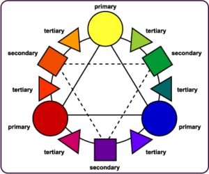
As you probably know from school, the primary colors are red, blue and yellow. All other colors are made by combining two or three of these colors. Primary colours are seen as simple and direct. So they would be good to use for projects that aren’t extravagant such as for preschools, kids’ stores, etc.

Secondary colours are half way between the three primary colours. They are orange, green and violet. Bright secondary colours can convey action and excitement. They would be great to use for sports brochures, restaurants that have a lively clientele, etc.

Tertiary colours are created when primary colors are mixed with adjacent secondary colours. Take a look at the colour wheel and notice which colours are considered tertiary. You’ll notice that they are in between primary and secondary colors. Teal and fuchsia are tertiary colours.

Hue, saturation and value of colours
Infinite colors can be created by altering three variables: the hue, the saturation and the value of the colour.

The hue is the shade of a particular colour. Deep hues of violet, gold, maroon, etc. are used by marketers to convey richness and security while earth tones feel natural and inviting.

The purity of a hue is the saturation. A highly saturated hue has a vivid, intense colour, while a less saturated hue appears more muted and grey.

Value refers to the relative lightness or darkness of a certain area. It is often used for emphasis. For example, variations in value are used to create a focal point for the design of a picture.

Colours often have different meanings in different cultures as we discussed before. If you will be working with a client from another part of the world, it would be beneficial for you to do a little research to find out what colours mean in that society.

Even in Western societies, the meanings of various colours have changed over the years. But today, researchers have generally found the following to be accurate:

Black
Black is the colour of authority and power. It is popular in fashion because it makes people appear thinner. It is also stylish and timeless. Use the colour black to convey elegance, sophistication, or perhaps a touch of mystery. Black works well with bright, jewel-toned shades of red, blue, and green. Black is the ultimate dark colour and makes lighter colours such as yellow really pop out. Photographs often look brighter against a black background.

White
Doctors and nurses wear white to imply sterility. In most Western countries white is the colour for brides; however, in Eastern cultures it’s the colour for mourning and funerals.

In most cases white is seen as a neutral background colour and other colours, even when used in smaller proportion, are the colors that convey the most meaning in a design. Use white to signify cleanliness or purity or softness. Some neutral beige, ivory and creams carry the same attributes as white but are more subdued, less brilliant than plain white.

Used with light or pastel tones, white is soft and spring like and helps to make the pastel palette more lively. White can make dark or light reds, blues and greens look brighter, more prominent.

Brown
Brown represents wholesomeness and earthiness. The colour brown and its lighter versions tan, taupe, beige or cream make excellent backgrounds helping accompanying colours appear richer, brighter. Use brown to convey a feeling of warmth, honesty and wholesomeness. Although found in nature all year round, brown is often considered an autumn and winter colour. It is more casual than black.

Shades of brown coupled with green are often used to convey the concept of recycling or earth-friendly products. Light brown implies genuineness while dark brown is similar to wood or leather. Brown can also be sad and wistful.

Red
Red is power. The most emotionally intense colour, red stimulates a faster heartbeat and breathing. It is also the colour of love. Use red to grab attention and to get people to take action. Use red to suggest speed combined with confidence and perhaps even a dash of danger. A little bit of red goes a long way. Small doses can often be more effective than large amounts of this strong colour. Multiple shades of red and even pink or orange can combine for a cheerful palette. Red is often used in restaurant decorating schemes because it is an appetite stimulant.

Pink
The most romantic colour is pink and can be tranquilising. Sports teams sometimes paint the locker rooms used by opposing teams bright pink so their opponents will lose energy. Studies have shown that large amounts of pink can create physical weakness in people.

Both red and pink denote love but while red is hot passion, pink is romantic and charming. Use pink to convey playfulness or tenderness. Add strength with darker shades of pinks and purple and burgundy.

All shades of pink get sophisticated when combined with black or grey or medium to darker shades of blue. Medium to dark green with pink is also a good combination.

Blue
Blue is one of the most popular colours. It causes the opposite reaction as red. Peaceful, tranquil blue causes the body to produce calming chemicals.

Blue conveys importance and confidence. Long considered a corporate colour, blue, especially darker blue, is associated with intelligence, stability, unity, and conservatism.

A deep royal blue or azure conveys richness and perhaps even a touch of superiority. Combine a light and dark blue to convey trust and truthfulness. Create a conservative but sophisticated look with subtle contrast by combining light and dark shades of blue.

Mix the color of blue with green for a natural, watery palette. Add grey for understated elegance.

Sky blue and robin’s egg blue, especially when combined with neutral light brown, tans, or beige are environmentally friendly color combinations.

Throw in a dash of blue to cool down a hot red or orange scheme. Grab attention with the contrast of blue and yellow.

Dark blue with white is fresh, crisp and nautical. Use dark blue with metallic silver accents for an elegantly rich appearance.

Green
Green symbolises nature. It is the easiest colour on the eye and can improve vision. It is a calming, refreshing colour. Hospitals often use green because it relaxes patients. Dark green is masculine, conservative and implies wealth.

With both a warming and cooling effect, green denotes balance, harmony, and stability. Use several shades of green for a fresh, springtime feel.

Green with blue produces echoes of nature, water and forest and can denote new beginnings and growth. Green with brown, tan, or beige says organic or recycled and can be a good colour combination for packaging of those types of products. Tri-color combinations of green with yellow and black or white are sporty, outdoorsy colors. Purple with green can be highly contrasting causing a lively effect.

Yellow
Cheerful sunny yellow is an attention getter. While it is considered an optimistic colour, people lose their tempers more often in yellow rooms, and babies will cry more. It is the most difficult colour for the eye to take in, so it can be overpowering if overused. Yellow enhances concentration, hence its use for legal pads. It also speeds metabolism.

Although it can work as the primary colour, yellow often works best as a companion to other colours. Use bright yellow to create excitement when red or orange may be too strong or too dark. Yellow can be perky. Use yellow to perk up a more subdued cool palette of blues and greys. Use lemon yellow with orange to carry out a healthy, summery, citrus theme. Very pale yellows can work as neutrals alongside darker or richer colours. Yellow and blue are a high contrast, eye-popping combination. Mix yellow with neutral grey and a dash of black for a high-tech look.

Purple
The colour of royalty, purple connotes luxury, wealth, and sophistication. It is also feminine and romantic. However, because it is rare in nature, purple can appear artificial.

Deep or bright purples suggest riches while lighter purples are more romantic and delicate. Use redder purples for a warmer color scheme or the bluer purples to cool down.

A deep eggplant purple with neutral tans or beige is an earthy, conservative color combination with a touch of the mystery that purple provides. Green and purple can be a striking combination in deep or bright jewel tones or use lighter shades for a cheerful, spring like feel. Pink and purple has feminine appeal.

Gold
The colour gold is associated with wealth and prosperity. Add a small amount of metallic gold ink to a project for a special, rich touch. Bright gold catches the eye while darker subdued shades of gold lend richness and warmth.

Orange
As a warm colour orange is a stimulant, stimulating the emotions and even the appetite.

If you want to get noticed without screaming, consider the colour orange, it demands attention. The softer oranges such as peach are friendlier, more soothing.

Orange really pops with a medium blue. Red, yellow, and orange can be a fiery hot combination or, in tamer shades, a fresh, fruity experience. Make it tropical by pairing it with green.

Orange is often synonymous with autumn yet the brighter oranges are a summer colour. Orange is mentally stimulating as well as sociable. Use it to get people thinking or to get them talking.

Turquoise
Create feminine appeal with lighter shades of turquoise. Some shades of turquoise have an old-fashioned 50s and 60s retro feel. Teal has a darker, somewhat more sophisticated look. Like the mineral, turquoise shades range from almost sky blue to deep greenish blues.

Keep the soft, feminine qualities going by mixing turquoise with lavender and pale pinks. A bright turquoise and pink create a sparkly clean, retro look. Make it art deco by pairing turquoise with white and black. Turquoise with grey or silver as well as terra cotta and light browns have a European flavour. Turquoise with orange or yellow creates a fresh, sporty look.

Grey
Like black, grey is used as a colour of mourning as well as a colour of formality. All shades of grey can be good, neutral background colours. Use lighter greys in place of white and darker grey in place of black. Taupe, a greyish brown neutral is a conservative, slightly earthy, warm shade of grey.

Light greys with pastel shades of pink, blue, lavender and green have a feminine quality. Darken those colours for a more masculine feel. Cool a warm palette by adding grey to rich reds or golden yellows.

Silver
Silver often symbolises riches just as gold does. Silver can be glamorous and distinguished.

It can be earthy, natural or sleek and elegant. Silver can be used much like grey although when using shiny metallic inks, small amounts for accents is best.

Silver coupled with turquoise evokes the Southwest. A touch of silver pops with medium blue. Use silver with other colours to create a high-tech or industrial look.

Share Button

Leaflet or Magazine Advertising

You have come to a point where you want to promote your business and are wondering what form of advertising to go for. Nowadays, there are numerous options available, from the Internet to print, but when you are a small business the first two ways that come to mind are most likely leaflets or an ad in a local magazine. So the question beckons leaflet or magazine advertising?

Both means of promotion work well on a local scale; however, when you consider all the pros and cons in more detail, leaflets turn out to be the most efficient strategy. Here are five key reasons why leaflet distribution is more effective than a local magazine advert.

  1. COST-EFFECTIVENESS

No doubt about it, for the price of the same size (A5) advert, usually a full page in local magazines, you can have twice as many leaflets printed. Leaflet distribution is a very affordable way of getting your name out to the wider public, and let’s be honest, when you’re a small business you don’t have a £1million+ marketing budget, do you?

  1. PERFECTLY TARGETTED AUDIENCE

When it comes to leaflet drops, we’re able to hand pick the most responsive areas for your campaign. We look closely at demographic and geographic factors and plan your distribution to ensure your leaflets go to those most likely to be interested in your services. We are even able to skip particular streets, to give you a fully tailored service. By contrast, with a local magazine you are not able to target specific areas in such detail, rather you are locked into the major areas that their distribution covers – and locked out of others.

  1. FLEXIBILITY

When it comes to designing your leaflet, the sky is the limit. Make it round, square, postcard, folded, DL – you name it, we can produce it. An ad gives you a standardised size scale, without much room to make your business really stand out. The flexibility leaflets provide also means that you can have two different design leaflets going out to various areas as part of the same campaign, whereas with an advert you’d have to pay for two advertising spaces, which would both be distributed to the same areas.

  1. QUICK TO PRODUCE

Had a change of heart? Realised you’ve put a wrong telephone number? With leaflet distribution we’re able to stop your campaign and quickly print a new batch, so you can always be sure that the right materials are going out. Unfortunately, with an ad, once it’s signed off to print you can’t call it back to update your artwork or copy.

  1. CONVENIENT

What’s easier to quickly fold and put into your pocket or bag? The answer is simple. Leaflets have the advantage that they can be easily stored for future reference, something a magazine doesn’t have. They are also a fantastic way of presenting your offer to the potential customer in a concise and direct way, whereas in a mag your ad might go unnoticed amongst a sea of others, thus producing no results but significantly draining your budget.

Next time you face an advertising decision-making moment bear in mind the features described above. Leaflet or magazine advertising is a big decision, these are only five of them, but in our opinion they are the most important aspects, particularly for small businesses. Affordable, well-targeted, flexible, quick to produce and convenient means are the most efficient and fruitful media to help you grow your company. Having over 9 years’ extensive experience we’re always here to help you promote your brand, so get in touch today to see how we can work together to achieve your business objectives.

We hope you got some value from this article, five reasons why leaflet or magazine advertising. If so leave your comments below.

https://en.wikipedia.org/wiki/Canvassing


Share Button